Fresh Designs Crochet: inspiration board (Mittens & Gloves)


These crochet mitten patterns for children are from 1916 and 1946. Would these look out of place in a book published today? Is it because they are classic, timeless designs? If you click the photos, the links will take you to websites that have the magazines these photos came from in more detail and I think you'll agree, most of the patterns in them would fit right into a Debbie Bliss or Lucinda Guy collection, so "classic" is accurate. I also think that crochet mitten patterns haven't changed much in almost a century. Crochet mitten patterns for colorwork beyond stripes and variegated/self-striping yarns are few. Danielle Kassner's Crochet Codex jaquard crochet mitts, mittens and cuffs patterns, for example, are exceptional, and arguably would stand out even if colorwork crochet mittens were more common. Still, part of what makes them exceptional is that they are, really, an exception to the standard. While one of the reasons is likely because crochet colorwork can make a very thick, stiff fabric, there are other approaches, including embroidery and appliqué, that can be used to add color and detail without too much bulk.


Pet peeve moment: the number of patterns for mittens/gloves that are just tubes with slits for thumbs suggests to me that we don't need any more of those (especially ones where the fabric is so thick it looks almost like you are wearing chopped-up oven mitts). Gussets and actual thumbs are not terribly difficult. Of course, that there are so many patterns available also suggests that they are popular and a lot of crocheters like to make them, so take that with a grain of salt.


The Fresh Designs Crochet call for submissions is open until June 11, 2011; guidelines and form are available from Cooperative Press.

Fresh Designs Crochet: inspiration board (Home)

Last year, I bought all 4 seasons of Mad Men and watched them repeatedly. I'd sit down with my laptop and a knit or crochet project and look for all the knit and crochet pieces in the episodes. I even have a spreadsheet detailing some of the pieces with the scenes and episodes they appear in (some come up repeatedly, like Peggy's scrapghan, and Betty's scrapghan - which are similar yet very different), and working out how the items may have been intended in the storytelling. Which is to say, I made up stories about a story.


Peggy's scrapghan, for example, which I included in the Fresh Designs Crochet: Home inspiration boards. What I saw was that Peggy's mother (and probably her sister too) were accomplished crocheters who made neat, tidy, sensible items like dishtowels and afghans (there's one afghan in particular that is visible in almost every scene that takes place in her sister's apartment). Peggy, however, learned to crochet enough to be able to make this rather messy, lumpy blanket that she loves and has taken with her from apartment to apartment. It's her comfort blankie. Betty has a very similar afghan that is basically the same, using yarn scraps in a shell-based pattern, but hers has very neat and even work, with stripes that look more planned out. She kept it, even when she went from being Betty Draper to being Betty Draper Francis. Betty was clinging to something too - the scrapghan still fits in with the Draper household in Season 1, but as Betty's social status rose and the rest of the home decor became more upscale, that scrapghan looked more and more out of place.


Anna Draper, on the other side of the continent, had a cream-colored crochet afghan with cross-stitched roses on them. Anna was surrounded by flowers - her garden, her decor, her clothes - but since her personal choices leaned more towards orangy-pink tropicals, I think her sister, Patty, may have made this blanket and given it to Anna. I bet Patty also knit Stephanie's fine-gauge cabled sweater, which Stephanie wore often but certainly not in the classic, demure way Patty probably hoped for.


I may be the only person who will be glued to the new episodes next year, hoping for a glimpse of these crocheted blankets.


The photo of a kitchen included in the inspiration boards isn't my kitchen, although it is similar to the one in a house I lived in recently. It was a small strip of space - sink, short counter, fridge, a shelf over the sink and counter, and a pantry made out of a cheap particleboard bookshelf. The door to the bathroom was right next to the sink. It was the kind of kitchen that does not get featured in a shiny magazine, unless it's the "before" of an extensive (and expensive) home remodeling project. The kind of kitchen that is a little too shabby to be shabby-chic. The kind of kitchen a lot of us have, right? I crocheted some things to brighten and love up that kitchen space, and I'm curious to see what other people would do in a similar space.


Overall, with the Home inspiration boards, I was thinking about everyday, ordinary life. What do we already have in our homes that we see every day, maybe so often that we don't really see them anymore? What are practical items that could be made beautiful without losing any practicality?


The Fresh Designs Crochet call for submissions is open until June 11; guidelines and form are available from Cooperative Press.


Fresh Designs Crochet behind the scenes: inspiration boards

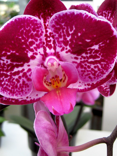
These photos were taken a couple of weeks before the Fresh Designs Crochet call for submissions went live. If you've seen the inspiration boards for the Scarves & Shawls, the photos of orchids ("how would you combine solid and variegated yarns?") were taken the same day as these were.

Orchid

When I started putting together the inspiration boards, I was thinking about how to provoke the creativity of individual designers. While I do have a general idea of the mix of patterns I'd like the books to have, I also want to be surprised.

Tulips ("Flamingo Parrot")

Some of the inspiration boards/story boards I've seen are very specific about what the publication is looking for (and I've seen one or two that were just this side of "make copies of these items"). The inspiration boards I put together for Sweaters, Kids, and Designs for Men are pretty standard - photos from runways and catalogs, blurbs about silhouette and color.

Tulips ("Davenport")

I got more free-form with the other boards, which Shannon was supportive of. There's been some positive feedback on them from designers, which was a relief for me; I have worried a bit about the inspiration boards scaring people off. All of the inspiration boards include links back to where some of the images used came from, for credit as well as to make it easier to continue exploring an idea. Some of the images I chose to be deliberately off-topic, like the microscopic photos of diatoms for the Toys inspiration board. "Diatoms? Toys? What? Huh?" - not everyone will respond that way, but I expect a lot people will. It's like mixing up a bunch of different seeds, grabbing a handful, tossing it out into a fallow field, and then waiting to see what sprouts. Someone might look at the colors and start thinking about a variegated yarn they just saw at their LYS. Someone else might start thinking about afternoons spent in a dusty attic, looking through a box of old National Geographic magazines. Where will it lead? I'm curious. Every time I check on the submissions for Fresh Design Crochet, I'm wondering what someone is going to share.